30 March 2011

Bat-Manga!

I think my most exciting Bat-development of the past few years has been the discovery of BAT-MANGA! THE SECRET HISTORY OF BATMAN IN JAPAN (2008), edited by Chip Kidd and Saul Ferris, with pictures by Geoff Spears.  Chip Kidd and Geoff Spears have done a bunch of Batmania related books, in addition to some nice collections of Alex Ross' work.  This time, they turn to collector Saul Ferris to unearth a series of Batman Manga that were published in 1966 by Manga Sensei Jiro Kuwata in the wake of the American TVshow.

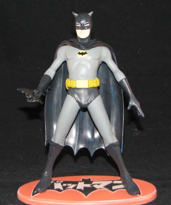
The book is the best insane translation of Batman ever.  Kuwata was given American scripts, which he adapted loosely for Japanese tastes.  The Manga are at their best when they let go of Western story conventions or model guides for the characters.  In this, I found my inspiration for my next figure.

As a guide, I wanted a Manga-related 6" action figure that I could base my work on.  I had to look no farther than the BATTLE OF THE PLANETS line, which gave me great options for the Caped Crusader.

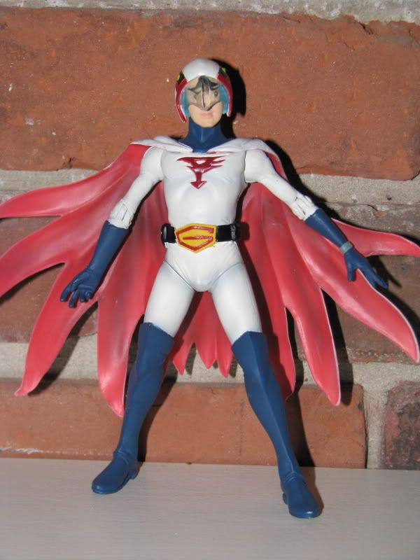
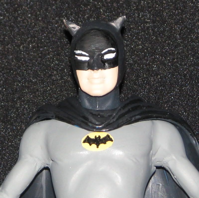
All of the basics are here, proportionally, and it has a Manga-influenced face that I wanted for my Bat-Manga.


The majority of details were removed and the costume was sculpted in place.  This was very basic work, consisting of modifying the boots, belt, chest and gloves.  Instead of creating a new cape, I used one from the DC Direct SILVER AGE BATMAN AND ROBIN boxed set.

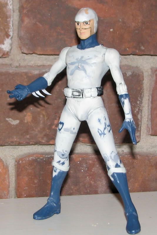
The biggest challenge for this work was the colour.  The Manga were usually done in grey tone on manilla paper.  It appeared that Bat-Manga had a two-tone cape (most likely to allow for detail in the artwork) and stripes on his boots and gloves.  I took my best guess and went for a combination of black, blue, and grey.


I searched in vain for colour work from Japan that portrayed the figure.  Most Japanese Batman toys were heavily based on American comics, so the majority of them have artwork that is very close to models of American artists.

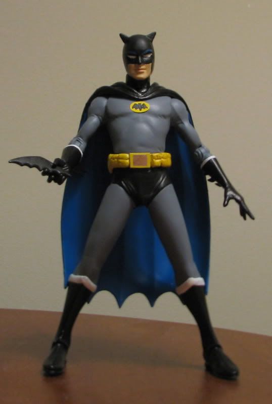
Book co-editor Saul Ferris listed his contact information and he was very enthusiastic about the figure.  He provided wonderful insight into the art, along with some images from his vast collection.  He wanted a Bat-Manga! Man Statue based on the colour data from his collection.

I enjoyed working on the statue, because it gave me the opportunity to change the sculpt and create a mold of the character.  I designed a base platform using the colours and imagery from the Manga and re-tooled the costume to match the art.  I had to be careful to level the mold correctly to get a good flow for the resin.


Originally, Saul wanted the figure to have the standard Batman look and to have the statue aged.  I'm glad he went with my alternate look, which emphasizes the differences in cultural interpretation of Batman.  I found aging the statue challenging.  In looking at his collection, most pieces from 1966 hadn't aged all that much.  Plus, how would you exactly get a lot of paint rub on what is ostensibly a statue?  I decided on gently rubbing the paint on the base, and selecting a washed out orange that might convey some age.


Finally, I decided to hand paint the statue, to give it a sense of age.  I'm not so sure this last part worked.  I will probably use my airbrush to re-paint the original.

Saul gave some wonderful art direction, which really improved the statue.  I think his colour palette works much better than my original one.  I intend to re-paint my original figure, possibly lightening the grey tights a bit more.

The best part of the deal has been making Saul's acquaintance.  He wants more- Robin The Boy Wonder and my favorite villain Lord Death Man.   I had planned a set of four characters, so perhaps I should make a few more...


   Will Bat-Manga continue?

   Will Lord Death Man haunt Bat-Manga from the    
   grave (or the next toy shelf)?

   Will we learn the identity of the fourth statue?

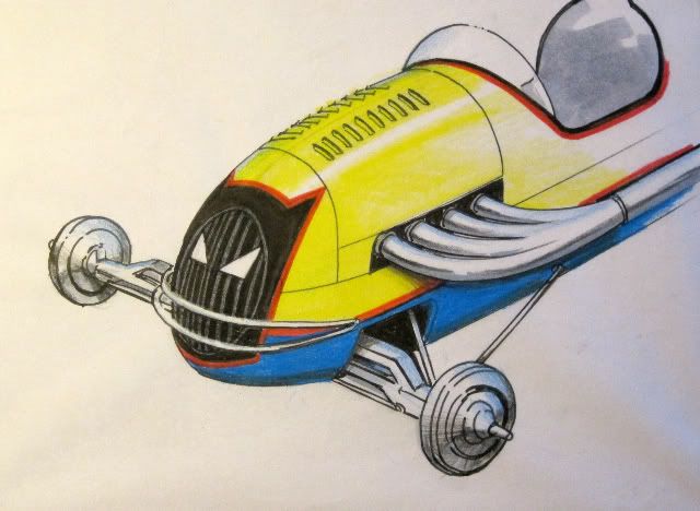
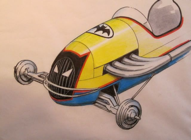
Tune in to the Flying Batmobile,

Same Bat Blog,

Same Bat Artist!

Comic Art Tuesday (Wednesday): Maguire, Perez, and Gene the Dean!

Kevin Maguire (TV Batman & Catwoman)
Ahh, it is spring and all thoughts turn to Flying Batmobiles!  In anticipation of some fun figure-making and Batmobile-tuning in the next month or so, I crack open the top shelf and dust off some fun art!  

Kevin Maguire can draw the phone book and I show up, checkbook in hand.  He was the reason I gave THE JUSTICE LEAGUE a try in the late Eighties, with the cover showing a team of heroes, standing there, looking up at you.  All of those unique, wonderful, diverse facial expressions looking back at you.  He is the master at communicating comic art through portraits.

When his art rep opened up a commission list, I jumped.  It took him a long time to get to it, but it was well worth it.  Kevin captured the essence of the 1966 TV show.  You probably can't tell from the image, but it's pencil.  Is that a #2?  I don't think so.

The work is crisp.  The detail is amazing.

I don't always get to meet the artist, but I make it a point to thank them when I do.  Needless to say, he remembered this one.

George Perez (Golden Age Batman)
Is there a comic fan alive who isn't familiar with George Perez?  George Perez, the Grandfather of the Rapidiograph, drew my adolescence in multi-panel brilliance.  His sense of arrangement and his commitment to detail and character is legend.

I grabbed a page of his JSA work, when the Golden Age Superman and Batman learn of the JSA's disbanding.  I so adore his Sprang-esque take on the Golden Age Batman that I had to ask him to do it again.

Batman, as barrel-chested guardian of Gotham.  This pen and ink included grey-tone washes for depth.


Gene Colan (BATMAN)
Finally, I include a true master: Gene "The Dean" Colan.  I certainly associate Gene with MARVEL comics, mostly through the DareDevil reprints of my youth or his Captain America work.  However, he was the Batman artist I loved the most in the monthly publications I read as a kid.

Of all American comic artists, I think Gene is singularly beyond us all with his abilities.  That is, I don't think we have the technology to fully appreciate his ability with the pencil.  Gene's pencil work has a depth and vibrancy that is removed when it's inked for publication.  Simply put, I don't think we "get" the art that Gene sees in his mind's eye.

Gene was very ill right after he took this commission.  I really thought he wasn't going to make it.

I rejoice that we still have The Dean in the world!


15 March 2011

Comic Art Tuesday: Fradon, Giordano, and Lew Sayre Schwartz

Ramona Fradon "BATMAN and ROBIN"


Ramona Fradon can draw the phonebook and I'm in love.  Ramona, the illustrator of my childhood.  Instead of testosterone-fueled musculature and adolescence-inspired cleavage, Ramona was an excellent storyteller with a minimum of lines.  SUPERFRIENDS was a great comic to read as a kid, with tons of guest stars and villains.  Her Dynamic Duo was what I had in my head growing up.

Every time I run into her I think of something new to get from her.  Maybe Batgirl next time... 


"The Justice Society" Dick Giordano
Dick Giordano was the unifying force of Batman in the Seventies, inking Jim Aparo, Neal Adams, and the other greats of the Bronze Age of comics.  My favorite Treasury comic was a JUSTICE LEAGUE edition that my brother received, mostly because of the cool front/back cover design work by Dick.  The back cover was the alternate universe team the "Justice Society", a collection of the Golden Age heroes (including a version of Batman) that started in 1939 and retired in the late Sixties or so. The Justice Society Batman supposedly never wore the yellow oval bat-insignia on his uniform.   My brother and I each asked Mr. Giordano to re-create one of the covers.


Lew Sayre Schwartz, Personal Correspondence
Definitely, as a kid of the Seventies, I read a ton of DC reprints.  My favorite Bat-artist had to be none other than Lew Sayre Schwartz, who created The Red Hood and the Gorilla Crime Boss of Gotham, amongst other memorable stories.  I think most fans agree that Dick Sprang was the best artist of the Golden Age of Batman, but Lew illustrated with a heavy brush, which added a comic strip quality to the work that was never duplicated.  

Meeting Lew was a wonderful opportunity.  Like many illustrators of his age, he served in World War II and was enthusiastic in talking about common interests.  A recent collection of Batman comic covers had just been released and we flipped through it together and found all of the mis-credits.  He is a cool cat, a bit of an ad man attitude about the whole thing.

I adore him.


27 February 2011

The Saga of the Golden Age Bat-Mite Part II

The 1949 Kurtis Racer
Man, I have fallen in love with the Kurtis Midget Racer and damn, do I hate yellow paint.  I did the body shell of the Golden Age Bat Mite in Tamiya spray and it took forever and a half.  The red is also Tamiya, with a shot of dull coat over it.  Every day this week I did another light coat and by Friday I had the yellow I wanted.


The 1949 Kurtis.


The dashboard was a mix of photo-etched metal, decals, and more plastic.  I also used the optional photo-etched steering wheel, which added a lot to the quality of the scale replica.  You can just make out the blue under body, which was painted in (yet another) Tamiya spray.

The next job was to figure out the front end of the car.  Sadly, the Golden Age Bat-Mite is the only car not fully pictured on the cover of WORLD'S FINEST.  Ahh, who can resist a challenge?


The Golden Age Bat Mite (R. Aikins).


A quick call to Pops and the man set down to business!  He came up with a proposal for the front grille design, which omitted the Bat symbol from the hood.  

It's brilliant.  

Pops kept all of the genre intact by using the bat-shield idea and placing bat eye inserts into the face. I also liked his idea of working red into the body.  The main problem?  He removed the bat symbol, citing concern about clutter in the design.  He may be right, but it's on the cover of the book, so...

The Bat Mite, v2 (R. Aikins).


Take II: A fully rendered image with the symbol back in (gotta love a man with time and pens!).  I love it and this is my goal to re-create in pulse-pounding 3 Dimensions.


Tune in next week.  

Same Bat Time,

Same Bat Channel!


08 February 2011

Comic Art Tuesday: Golden Age Batman


There's already been a bit of writing about the original design of Bob Kane's Bat-Man, and how much he was influenced by Bill Finger's bat-related revisions.  Needless to say, it worked.


Steve Leiber, of WHITEOUT fame, did this homage to the cover of DETECTIVE COMICS #27.  Clearly, Steve is a man who is not afraid of ink.


Michael Lark, from my favorite GOTHAM CENTRAL book, tore the roof off the joint with this amazing commission.  Clearly inspired by the classic BATMAN movie serials, I love his use of shadow and textures in this picture.

Enjoy!

06 February 2011

The Saga of the Golden Age Bat-Mite Part I

Another crazy invention of the Golden Age of Batman included his friendship with Superman.  The idea that Superman needed Batman and Robin is a crazy one and probably defines the logic of post-modernist comix authors, but there is great charm in seeing these guys get along.  The relation between The Man of Tomorrow and The Dynamic Duo is no more evident than on the covers of WORLD'S FINEST.


WORLD' FINEST COMICS #34 (1949)
Each issue had a cover depicting another event that the World's Finest Heroes were engaged in, most of them a variant of Middle Americana.  In 1949, that included Midget Racing.  The Kurtis Midget Racer is a milestone of the 20th Century racing.  First outfitted with an Edelbrock V-8/60 Ford Flathead, the Midget tore the roof off of post-WWII racing.  If you want to learn how to race, you start with a gear box, an engine, and a tube frame.  Holy be-jeezus, there ain't much between you and asphalt.  Once you get the rhythm of the track, it's like nothing else.

A friend sent me this image, knowing of my fondness of Batmobilia.  It just so happened that a new scale model kit of the Kurtis Midget Racer with the Edelbrock engine debuted at the same time.  Such Kismet is undeniable and so off to the shop I went...   


The 1949 Kurtis Racer, with V-8/60.  Revell 1/25 (2011)
At 1/25 scale, I've never built something so fragile.  The suspension and nerf bars could break if you held them too tightly.  Or sneezed.  The kit is beautiful and comes together like an intricate snowflake.


The next steps are to assemble the cockpit (with etched metal steering wheel and dash board) and get the two-tone paint scheme onto the rear cockpit.


The more I study the comic cover, I realize that everyone is likely driving the Offenhauser.  Sigh.  Perhaps the motivation to build one for Robin?  Do we need Superman too?


Same Bat Time, Same Bat Channel...

24 January 2011

Batmobile History Part I: The Pulps (1939-1941)

 
The Golden Age of Batman is my most favorite, because of the rawness of the ideas.  With nothing sacred, nothing written in stone, Bob Kane, Bill Finger, and Jerry Robinson had to carve out their own unique blend of pulp fiction and heroic fantasy.  One of the interesting challenges of The Bat-Man, a grim avenger of the night armed with his wits, was to figure out how he operated in Gotham.  Unlike his Pulp contemporaries, Doc Savage, The Avenger, The Shadow et al, Batman worked alone.  No one to get him from place to place and no powers beyond the keen of mortal man to speed it up.

The 1/64 JOHNNY LIGHTNING Bat Gyro (2002)
In 1939, the Bat-Man's original mode of transportation was a bat-stylized auto gyro.  It's a great visual concept, borrowing from vehicles used by Doc Savage and The Shadow, but adding a unique comic imprint. How can anyone resist the image of a giant bat looming over the city in the moonlight?  This did wonders for striking fear in the hearts of criminals, but made it tough to actually get the bad guys, as landing an auto gyro in the middle of Gotham City was never easy and autopilot only goes so far.


During the first two years of his appearances in Detective Comics, the Bat-Man employed several nondescript sedans.  Left to a four colour palette, it's not surprising these cars started out red and then were bright blue.  Also, given the visual appeal of the Bat-Man, most were convertibles.

The artists of these comics, Bob Kane, Jerry Robinson, Shelly Moldoff, were by no means industrial designers and their cars showed it.  Nevertheless, these crude comics have great appeal.


My biggest surprise was when CORGI decided to make 1/50 reproductions of not only the red sedan from Bat-Man's first appearance in DETECTIVE COMICS #27, but also this black roadster.  These toy cars represent amazingly faithful reproductions of rather poorly drawn cars.

It wouldn't be until 1941 when the term "Batmobile" was first coined by writer Bill Finger.  By that point, Bat-Man would be "Batman", have a Boy Wonder Sidekick, and a gallery of bizarre rogues.  


For these initial stories, Bat-Man was a raw vigilante, fighting crime and supernatural villainy by moonlight.  The time was Pulp.  
No one cared what car you drove.  In part, the anonymity of a sedan was part of the point.  


I think that's the point of departure for Super Hero comics, when suddenly tights, capes, and eye-popping fantasy started encroaching into the dark corners of Pulp.  For me, that started with a bright red car with a big honking bat hood ornament.